


Integritea
Business integrity was a known function within Lipton Teas and Infusions but the principles and values it protected were not universally known. It needed to be re-established as a central pillar within the organisation, a constant to effectively support all employees, globally.
As the lead on concepting and art direction, I helped reposition Lipton's business integrity initiative under a new name and identity. We designed clear and accessible training materials by breaking down complex policies into engaging visual content. The global roll out took place over a 12-month period where an awareness campaign was launched to introduce and train all employees on their updated management policies and best practices.
CLIENT
Lipton Teas and Infusions
CLIENT
Lipton Teas and Infusions
CLIENT
Lipton Teas and Infusions
Role
Project Manager Designer
Role
Project Manager Designer
Role
Project Manager Designer
Service
Communication Design for Corporate Learning
Service
Communication Design for Corporate Learning
Service
Communication Design for Corporate Learning
Putting the 'Tea' in Integrity
Putting the 'Tea' in Integrity
Putting the 'Tea' in Integrity
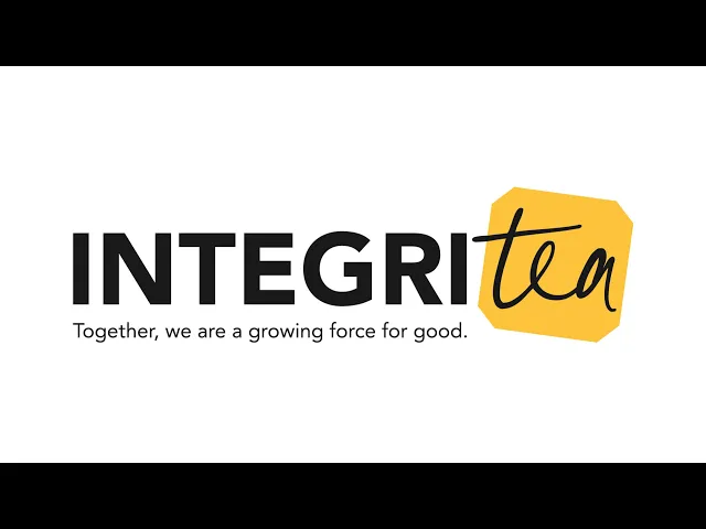
There are many reasons as to why we landed on ‘Integritea’ – it’s witty, it gives reference to the company’s purpose, and it’s a clear declaration of the campaign objective. When I went into designing, I looked at the features (as listed) of the name to see what I could use as a springboard to develop an identity – and for me, that would be to find something simple that we could draw back to the Lipton brand.

There are many reasons as to why we landed on ‘Integritea’ – it’s witty, it gives reference to the company’s purpose, and it’s a clear declaration of the campaign objective. When I went into designing, I looked at the features (as listed) of the name to see what I could use as a springboard to develop an identity – and for me, that would be to find something simple that we could draw back to the Lipton brand.
There are many reasons as to why we landed on ‘Integritea’ – it’s witty, it gives reference to the company’s purpose, and it’s a clear declaration of the campaign objective. When I went into designing, I looked at the features (as listed) of the name to see what I could use as a springboard to develop an identity – and for me, that would be to find something simple that we could draw back to the Lipton brand.
Creating the Perfect Blend
Creating the Perfect Blend
Creating the Perfect Blend
I became fixated on the shape of their tea tag while looking for everyday brand touchpoints. Although it is subtle, I noticed the shape is distinctly different across competitor brands therefore making it a great symbol to represent Lipton in the identity. It was important to keep the design system simple and closely aligned to the main brand to balance information density while reinforcing their message of integrity.

I became fixated on the shape of their tea tag while looking for everyday brand touchpoints. Although it is subtle, I noticed the shape is distinctly different across competitor brands therefore making it a great symbol to represent Lipton in the identity. It was important to keep the design system simple and closely aligned to the main brand to balance information density while reinforcing their message of integrity.
I became fixated on the shape of their tea tag while looking for everyday brand touchpoints. Although it is subtle, I noticed the shape is distinctly different across competitor brands therefore making it a great symbol to represent Lipton in the identity. It was important to keep the design system simple and closely aligned to the main brand to balance information density while reinforcing their message of integrity.
A Tasteful Experience
A Tasteful Experience
A Tasteful Experience
The training module was built to help individuals build lasting understanding of their business principles. We optimised the learning experience by breaking down elaborate content into digestible portions. The interface is designed to be visually stimulating by pushing the visual system to create distinctive designs for each section for enhanced retention. As a bonus, we built in a ‘save and quit’ feature to provide individuals the flexibility to complete training at their own pace.

The training module was built to help individuals build lasting understanding of their business principles. We optimised the learning experience by breaking down elaborate content into digestible portions. The interface is designed to be visually stimulating by pushing the visual system to create distinctive designs for each section for enhanced retention. As a bonus, we built in a ‘save and quit’ feature to provide individuals the flexibility to complete training at their own pace.
The training module was built to help individuals build lasting understanding of their business principles. We optimised the learning experience by breaking down elaborate content into digestible portions. The interface is designed to be visually stimulating by pushing the visual system to create distinctive designs for each section for enhanced retention. As a bonus, we built in a ‘save and quit’ feature to provide individuals the flexibility to complete training at their own pace.
Cross-channel Infusion
Cross-channel Infusion
Cross-channel Infusion
We produced a series of print assets like posters, pull-up banners and table talkers to be displayed around the office for the launch of the awareness campaign. Viva Engage posts, animations, and GIFs were created to introduce the new framework across multiple channels. Training resources like manager toolkits, 1-page guides, and quarterly live session material were produced to enable leadership and managers to provide guidance to all employees and are intended to give the staff support at any moment through a common and accessible touchpoint.
We produced a series of print assets like posters, pull-up banners and table talkers to be displayed around the office for the launch of the awareness campaign. Viva Engage posts, animations, and GIFs were created to introduce the new framework across multiple channels. Training resources like manager toolkits, 1-page guides, and quarterly live session material were produced to enable leadership and managers to provide guidance to all employees and are intended to give the staff support at any moment through a common and accessible touchpoint.
We produced a series of print assets like posters, pull-up banners and table talkers to be displayed around the office for the launch of the awareness campaign. Viva Engage posts, animations, and GIFs were created to introduce the new framework across multiple channels. Training resources like manager toolkits, 1-page guides, and quarterly live session material were produced to enable leadership and managers to provide guidance to all employees and are intended to give the staff support at any moment through a common and accessible touchpoint.
Cross-channel Infusion
The Impact
The Impact
The Impact
3 categories won in the 2025 Internal Communications and Engagement Awards
4000+ visits to the dedicated intranet pages
97% employees completed the training, made a pledge to work with and follow ‘Our Code’
3 categories won in the 2025 Internal Communications and Engagement Awards
4000+ visits to the dedicated intranet pages
97% employees completed the training, made a pledge to work with and follow ‘Our Code’
3 categories won in the 2025 Internal Communications and Engagement Awards
4000+ visits to the dedicated intranet pages
97% employees completed the training, made a pledge to work with and follow ‘Our Code’
PROJECT CREDITS
Agency // MGA
Strategy // Damien Millns
Account Director // Andrew Pamphilon
Account Manager // Sara Orhin
Creative Director // Colin Goad
Designer // Audrey Chan
Copywriter // Mark Herring